You're typically drawn straight into the first intersecting points the join Eddie right? well this photo of Eddie wasn't originally taken in a rule-of-third style, but with photo shop and a can-do attitude you can turn any photo to suit this layout! Originally Eddie was right in the middle, at first I thought it looked great, but after fixing a few things I find this to be more interesting and shows a lot more depth. It makes the guitar look kind of sexy and mysterious. the curvy lines and the silhouette, the backlight showing you just what the object is(with help of my other photos) without revealing too much. I think this photograph captures my passion for the guitar more than any. What do you think of this?

This photo was originally taken as is, I found that it was naturally rule-of-third-esce? idk.. But each intersecting point does hit the main focal point that I wanted you to notice first. Eddie! But because I am such a bad boy it kind of breaks the rule of thirds rules, while still being ahh idk.. rule of thirdy. I think this is one of the more visually interesting photos i have taken. I like the view down the neck, and that odd looking light that my mum brought me a few years ago, isnt it cool? in my opinion this photo captures elegance and speed. wow guitars look good.

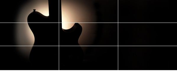
This photograph of Ned the Neck, Eddies closest friend(apart from me) was like the first photo, it was shot straight on but with that can-do attitude it was transformed and fitted into a rule-of-third type photo. which I like even more. You are kind of automatically drawn to Ned as it is the main feature. AND intersects perfectly(a+ for you terry!!!) I like the space on the right that contrasts well with the left side. The space is a good breather too. To me, I find this photo to be very peaceful. This is kind of far fetched but this photo reminds me to look at the beauty in life. Like as if this photo was taken in a rush and somehow everything perfectly synced up and this happened. as if everything was moving so quickly and right in the midst of perfection and craziness Eddie was in the right place. and if you look at the 2 black dot thingies and the dirt on the fret below it kind of looks like a face.. idk
terence those are lovely photos. well done. I will put some more advice up later, little girl keeps pressing buttons as i type...
ReplyDeleteRight, so what does your folio board look like? Do you have a digital version of it? or have you at least mocked up that smaller one with these photos included? there is a lot of cropping making the images look panoramic. that could be seen as a bit sneaky (purists would prefer photographers did absolutely no cropping) or you could play that up as a device in your work and play with long and thin, but it would have to be consistently done and it would have to benefit your concept. could you start thinking about your work as a visual expression of a song, with riffs and breaks and repetition, dark areas, ...? You could benefit from looking up and learning something about a painter called Kandinksy who painted to music. He had something called Synaesthesia which meant when he heard a sound he say a shape or a colour. His work is abstract and he painted to classical music, but its potentially worth exploring.
ReplyDeleteI really liked how you used the lighting in these photo's. Give's off some amazing shadow's :)
ReplyDeleteI really like the first photo! like possibly one of my favorites of the class eh. The lighting draws the attention to the shape of the guitar! and creates the center of interest, good work :)
ReplyDelete